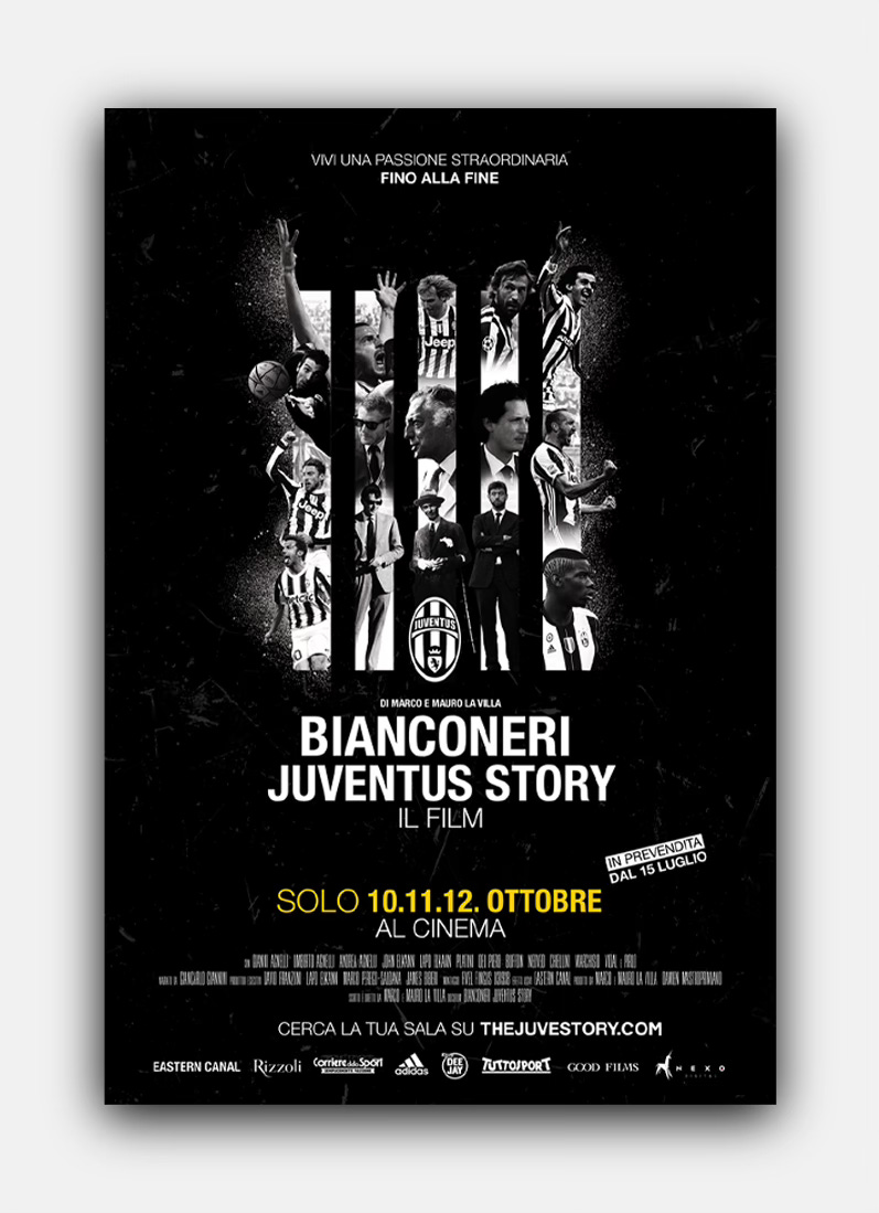
When it came time to prepare for the film’s launch in Italy, our focus turned to the poster — the face of the movie. A poster isn’t just a marketing tool; it’s the image that must carry the story into city streets, onto billboards, and across the web. It has to capture the essence of the film in a single frame and stir enough excitement to make someone want to see it.
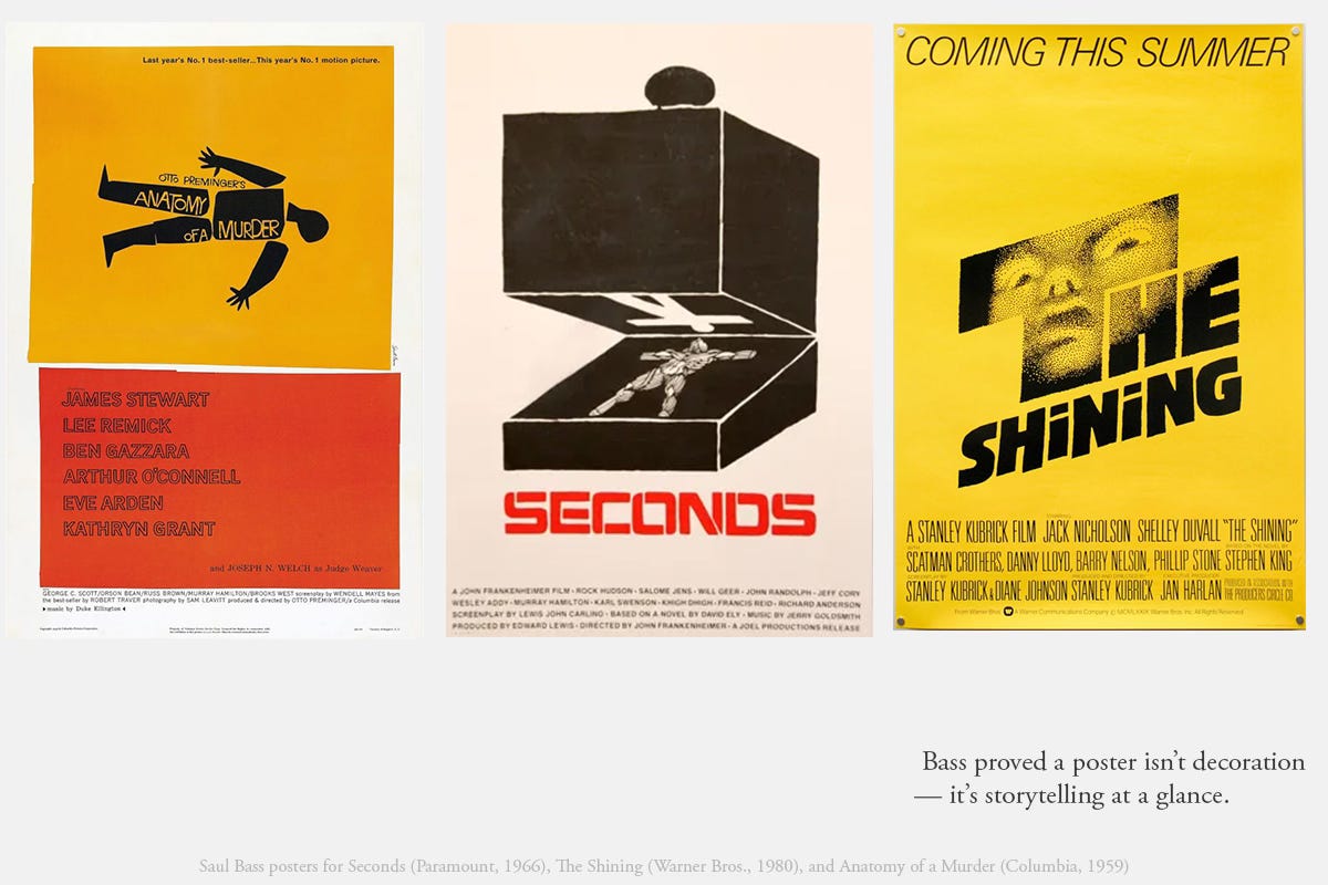
When you talk about film posters, you inevitably start with Saul Bass. His work defined the medium… elegant visual solutions, bold graphic composition, instantly iconic logos, unforgettable opening credits. Saul Bass remains the maestro, and his legacy was part of our inspiration. His work reminded us that a poster only succeeds when it captures the soul of the story.
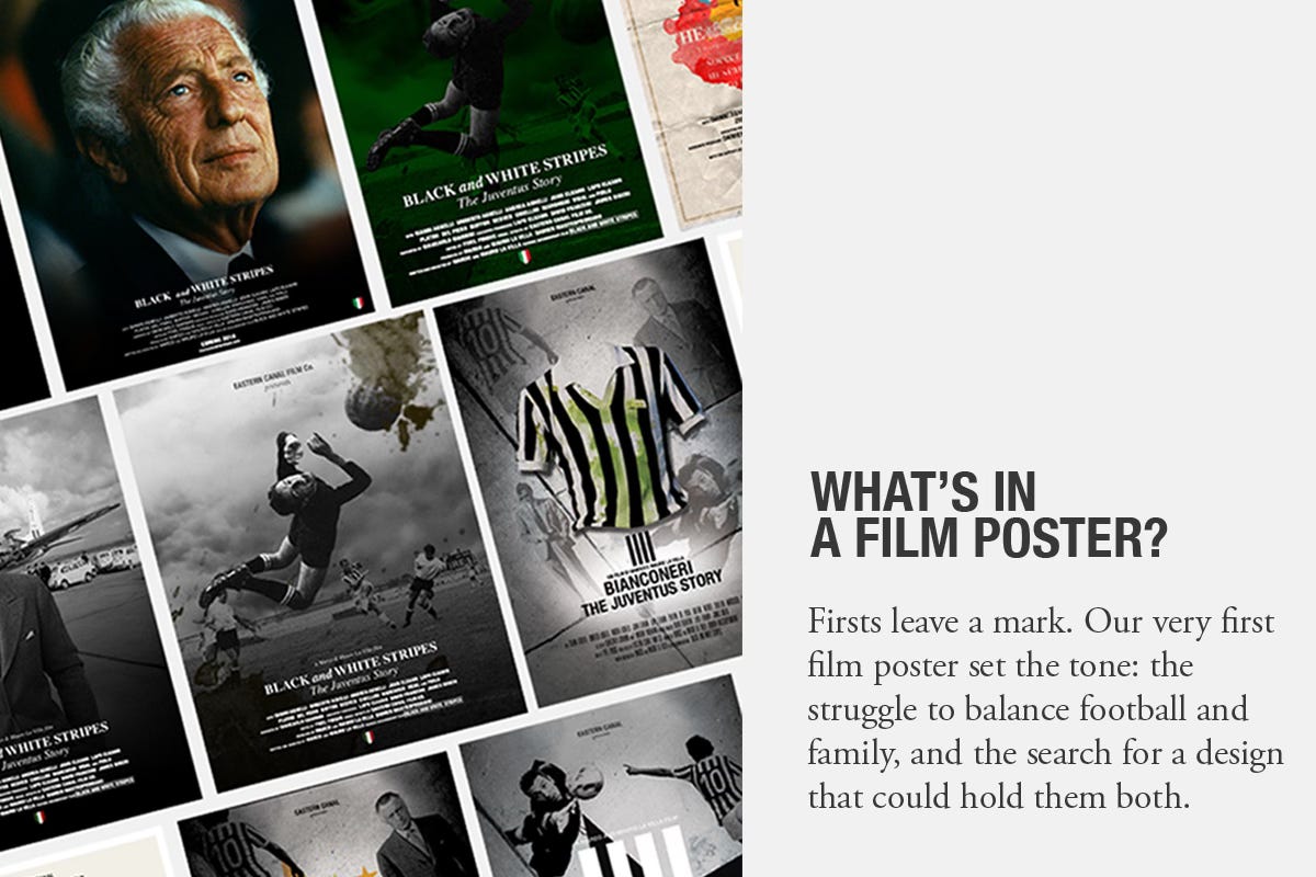
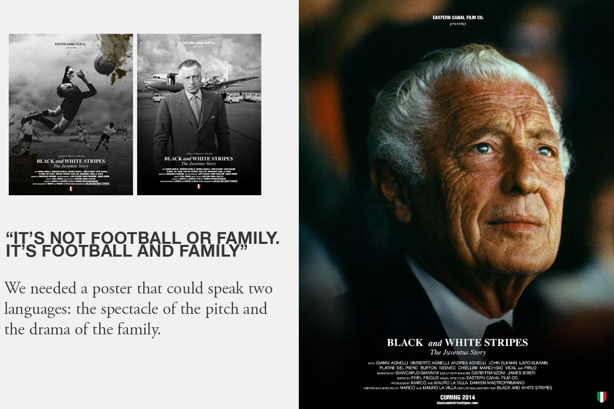
The first attempts, done internally and with outside designers, leaned on the five-stripe logo and tried to weave in players. But the result felt incomplete. The story didn’t yet live in the design. Ours could never be just about players. It had to be about football and family, together.
After multiple iterations, by the first design team we were told that fitting so many characters within the five stripes just couldn’t be done. It was an ask that demanded too much weight to balance. More drafts piled up, dozens of experiments, each circling closer to what we wanted but never quite arriving.


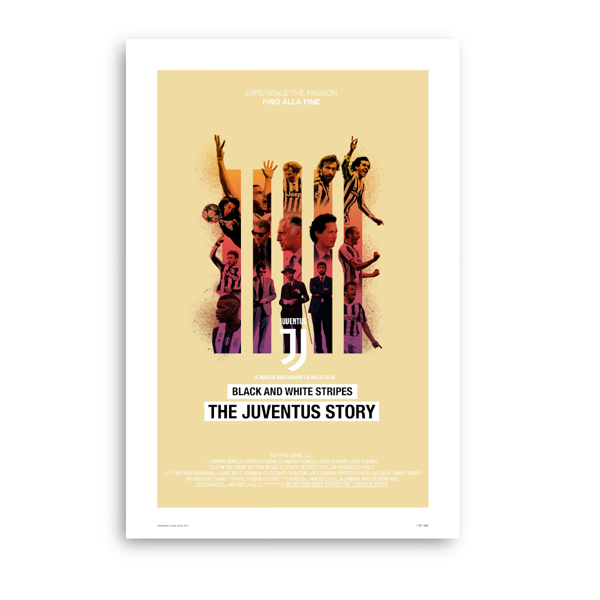
It took a fresh perspective, a new team of designers (who happened to be Juventini), to finally crack it. They lined up family at the center, with football orbiting around them and in the stripes as we so desperately wanted. Simple. Inevitable. True to the story.
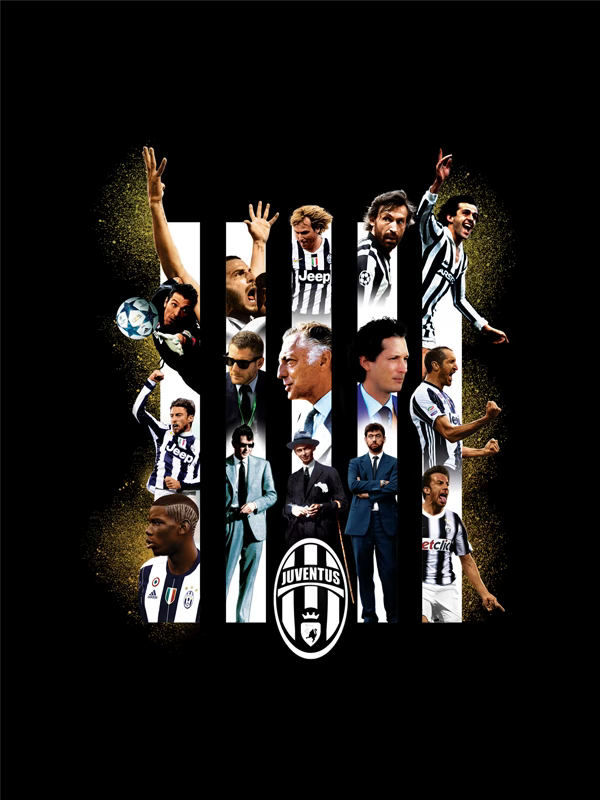
Here we present not only the final design, but also the many near misses and variations, that mark the path to the poster we chose. Together they trace a journey: from pure football to the fuller truth — football and family, united in black and white.
You can own a truly unique piece of cinematic and football history with The Juventus Story Special Edition Collector’s Poster. This isn’t just a poster; it’s a museum-grade print, a tribute to the legendary Bianconeri, and a rare collectible for the most dedicated fans.
Each poster is meticulously printed on premium stock, ensuring exceptional color vibrancy and archival quality that will stand the test of time. Limited to an exclusive run of only 100 prints, every poster is individually numbered, guaranteeing its authenticity and rarity.